From a Block of Clay to a City: Designing the Second Iteration of Applied Intuition’s Brand Language
September 10, 2020
Last year we revealed a new logo and brand for Applied Intuition that were designed to scale up with the core mission of the company. We also debuted a new website with the first iteration of our brand language: bold uses of white space, selective color, and strikingly minimal, clay-like 3D imagery.
Not only has the Applied Intuition brand matured since that launch, but we’ve also significantly expanded our product portfolio and customer base. In short, the story we were telling on our website was lagging behind the reality of our progress.
These two factors were the impetus for launching our new website, which was designed and implemented completely in-house. In this blog, we’ll share our methodical approach to creating a far more informative, vibrant, and richer expression of the Applied Intuition brand and other visual updates that make our new website more robust and dynamic.

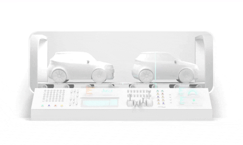
If you’ve spent any time on our website, you probably remember the little blue Applied Intuition car driving around a city block. We began the evolution of our design language with this car because it’s the smallest unit of our brand DNA, meaning that we could use the design decisions we made here to inform every other aspect of our brand and website.
Because of the thick trim around the vehicle base, lug nuts in the tires, and slatted grill, the original Applied Intuition car felt like a relic (similar to the VAZ-2101). While we wanted to retain the overall optimistic nature of its design, the new car also needed to embody the primary shift taking place in the automotive industry: from producing gasoline-powered, human-driven vehicles to electric-powered, software-driven vehicles.

With this goal in mind – and taking inspiration from some of the best designed vehicles on the road today – we began to carve out crude shapes from a digital block of clay.

From adjusting rough angles to key lines, we molded and sketched our way into details like headlights and taillights, windows, and doors.

But as we added sleeker, more futuristic details (like the continuous taillight, roof, and windows), the mood of the car became too aggressive. So we rounded both the lights and mirrors and created large, button-esque rims to compensate. These exaggerated, toy-like features ensured the car was futuristic and friendly.
One of the defining attributes–and our favorite detail of the car–is the ridge line that wraps around the rear of the vehicle and falls just below the windows on each side. Both this and the subtle indentation of the hood were inspired by James Turell’s Roden Crater.

With the car complete, we moved on to creating its surrounding environment. While our previous set of 3D animations communicated the outcome of autonomy by showcasing the car on open roads, we wanted to focus the next narrative on the process of autonomy: software development.

Depicting the complex and abstract ideas of autonomous vehicle software development (like “drive data,” “perception,” “validation,” and “simulation”) in a simple, compelling way is challenging. We’ve seen others rely on visual cliches–like Matrix style 1s and 0s, or software engineers sitting at desks––to communicate these ideas. But we find these approaches both uninspiring and stuck in the uncanny valley.
In search of a fresh form of expression, we turned to the physical manufacturing and assembly of vehicles as the central metaphor for our visualizations. We translated the production lines for chassis, doors, and paint jobs into a factory for creating and assembling the many elements of AV software development.

The factory setting provided a logical framework and ample visual references – like assembly lines and mechanical arms – to successfully convey concepts such as extracting and sorting through data captured from drives and simulations.

We pushed the factory concept further by creating imaginary machinery that reflects the digital nature of software, like this cylinder that holographically transfers software onto the car via factory floor...

… or this hydraulic treadmill that hallucinates immersive scenes around the vehicle as a way to communicate the many different use cases of simulation.

The last piece of our brand imagery in need of an update was the city block. We went through several, rapid rounds of iterating on the city layout, tweaking the density of buildings and roads in our attempts to identify the optimal looping route for the hero animation on our homepage.

The final city design was the culmination of everything we had put into designing a brand new car and factory: the continuous window and roof of the hero car informed the glass computer screens on the equipment in the factory, which informed the large glass windows of the buildings. And the way the cubes of data were transported underground in the factory animations inspired the transition of the city roads into underground tunnels.

We’ve invested heavily into these animations because they bring an energy level and sense of liveliness into the website that static images simply can’t achieve. The dynamism of the animations led us to creating more interactive elements on the website, like clicking through the different modules on the simulation page.

While a core part of our brand language is rooted in the concept of white, pages in our previous website didn’t have enough contrast to break up extended moments of white space. In this iteration, we changed our headlines to be a larger, bolder, font and introduced a light grey into the palette (made from the dark blue text in the Applied Intuition logo at 3% opacity) for an improved visual hierarchy.
We also leaned into Applied Intuition’s dark blue for the first time as a way to distinguish Applied Intuition’s Professional Services from our products. The rich, dark blue background on the services page is unexpected but still on-brand.

At Applied Intuition, we think deeply about the core concepts that drive our design decisions – like Kenya Hara’s book “White” or Kris Sowersby explaining his Signifier typeface – because doing so is the only way to create original work and solve novel problems (also because it’s fun. Look at all those animations!)
Originality is crucial for design at Applied Intuition because developing software for autonomous vehicles is a labyrinth of technical challenges. And you can take it from us: building tools with a great user experience that makes it easier for engineers to develop autonomous vehicle software is far more challenging than designing a website.
If you’re a product designer who resonates with the ethos and creative process covered in this article, check out our careers page – we’re hiring!
.webp)
.webp)